
Banner Image: Add a banner to your reel
The Banner Image block displays a wide image across your reel. You can control how the image crops on different screen sizes, set height limits, and add decorative frames.
Jump to: Adding a banner · Display settings · Sizing recommendations · Banner styles · Common questions
Adding a banner image
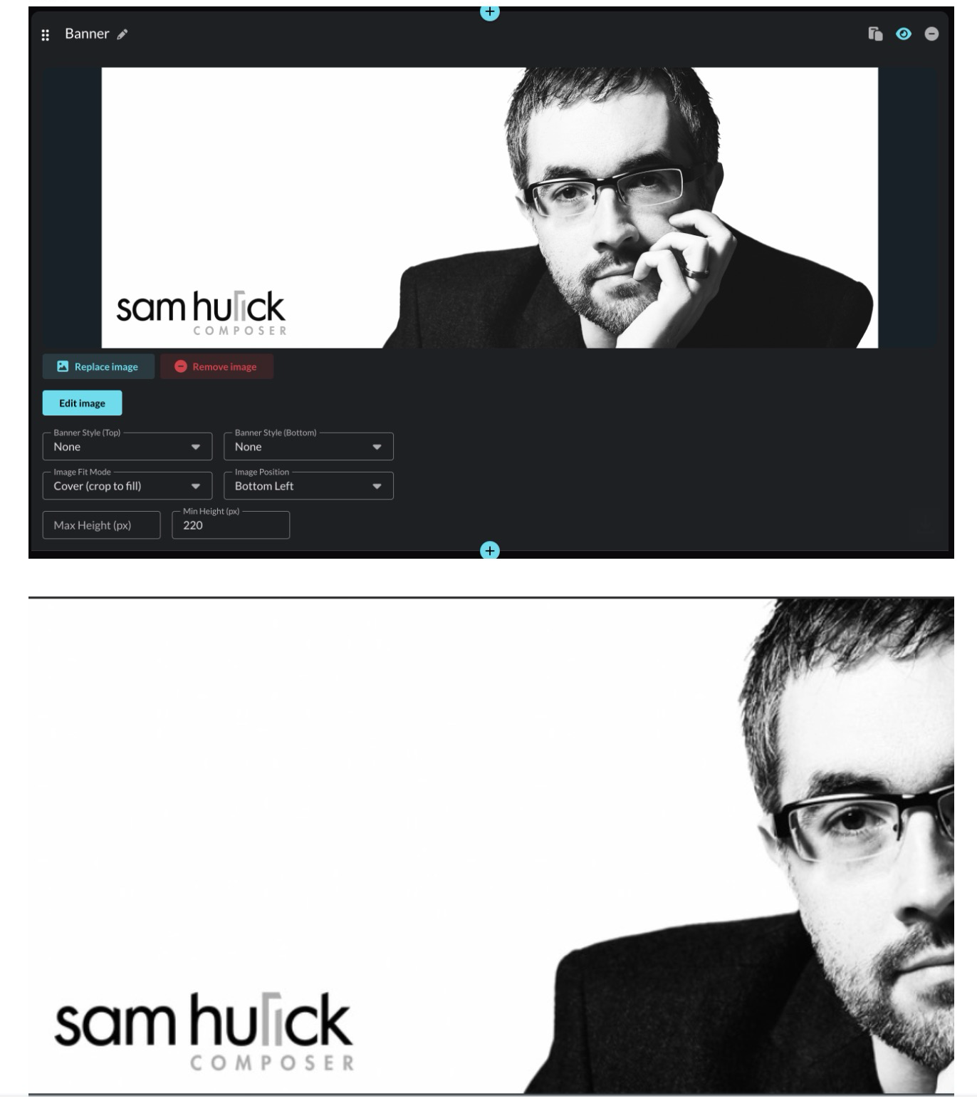
Click the Banner Image block to open it, then click Choose Image to select an image from your library or upload a new one.

To change an existing banner, use Replace Image or Remove Image.

Display settings
These controls determine how your banner image resizes and crops on different screen sizes.
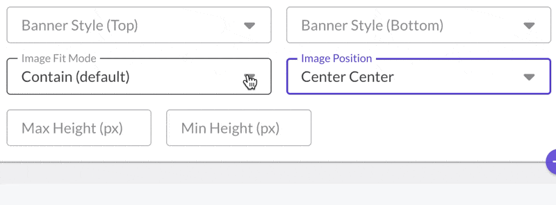
Image Fit Mode
- Contain: Shows the entire image without cropping. May leave empty space on the sides. Best for logos or graphics where nothing should be cropped.
- Cover: Fills the entire banner area, cropping as needed. Best for photos where some cropping is acceptable. This mode offers the most flexibility when used with Min/Max Height settings (see below).
Image Position
When using Cover mode, this determines which part of your image stays visible when cropping occurs. If the important part of your image is on the right, set position to "Right" so it stays visible on narrow screens.
Min Height / Max Height
Min Height prevents your banner from becoming too thin on mobile. A value of 200–250px keeps it looking good on small screens. Max Height caps how tall the banner can grow on large monitors. These settings work best when using Cover fit mode.
Sizing recommendations
- Recommended width: At least 2400px for full-width display on large monitors
- Minimum width: 1100px, otherwise your banner may appear narrower than your reel content
Height is flexible since you control it with Min Height and Max Height settings. When in doubt, go wider.
Banner styles
Banner styles add a decorative frame to the top and/or bottom edge of your banner using your reel's background color.

To add a style, open the Banner block and choose a style for Banner Style (Top) or Banner Style (Bottom). You can style each edge independently.
Style options
Gradient: A soft fade from the banner edge into your reel background.

Page Tear: A rough, organic edge.

Peak: A centered peak shape.

Waves: Layered wave shapes. Toggle Animated for subtle motion.

Common questions
What size should my banner image be?
Your banner image should be at least 2400px wide for best results on large desktop monitors. The minimum recommended width is 1100px. Height is flexible since you control it with the Min Height and Max Height settings.
Why does my banner image look different on mobile?
Banner images resize based on the viewer's browser width. On mobile devices, the banner becomes narrower, which can cause cropping (in Cover mode) or scaling (in Contain mode). Use the Min Height setting to prevent your banner from becoming too thin on mobile, and set Image Position to control which part stays visible when cropping occurs.
Why is my banner image cropped?
If your banner image is cropped, you're using Cover mode. Cover fills the entire banner area, cropping edges as needed. To see your full image without cropping, switch to Contain mode. If you want to keep Cover mode but control what gets cropped, adjust the Image Position setting.
Why doesn't my banner image stretch to fill the width?
If your banner image doesn't reach the edges of your reel, your image file may be too narrow. Upload an image at least 1100px wide (2400px recommended) so it can stretch edge-to-edge on wider screens.
How do I keep important parts of my banner visible when it crops?
Use Cover mode and set Image Position to match where the important content appears. For example, if your text or subject is on the right side, set Image Position to "Right" or "Bottom Right." This anchors that area so it stays visible on narrower screens.
What's the difference between Contain and Cover?
Contain shows your entire banner image without cropping, but may leave empty space on the sides. Cover fills the entire banner area and crops edges as needed to fit. Use Contain for logos and graphics where every pixel matters. Use Cover for photos where you can use Image Position to focus on a subject that works on both wide desktop screens and narrow mobile screens.
Do banner styles work on all browsers?
Banner styles may not display correctly on older browsers like Safari 13 or earlier. Preview your reel on different devices to check.
Can I hide the banner?
Yes. Click the eye icon in the upper right of the Banner Image block to hide it from your reel.